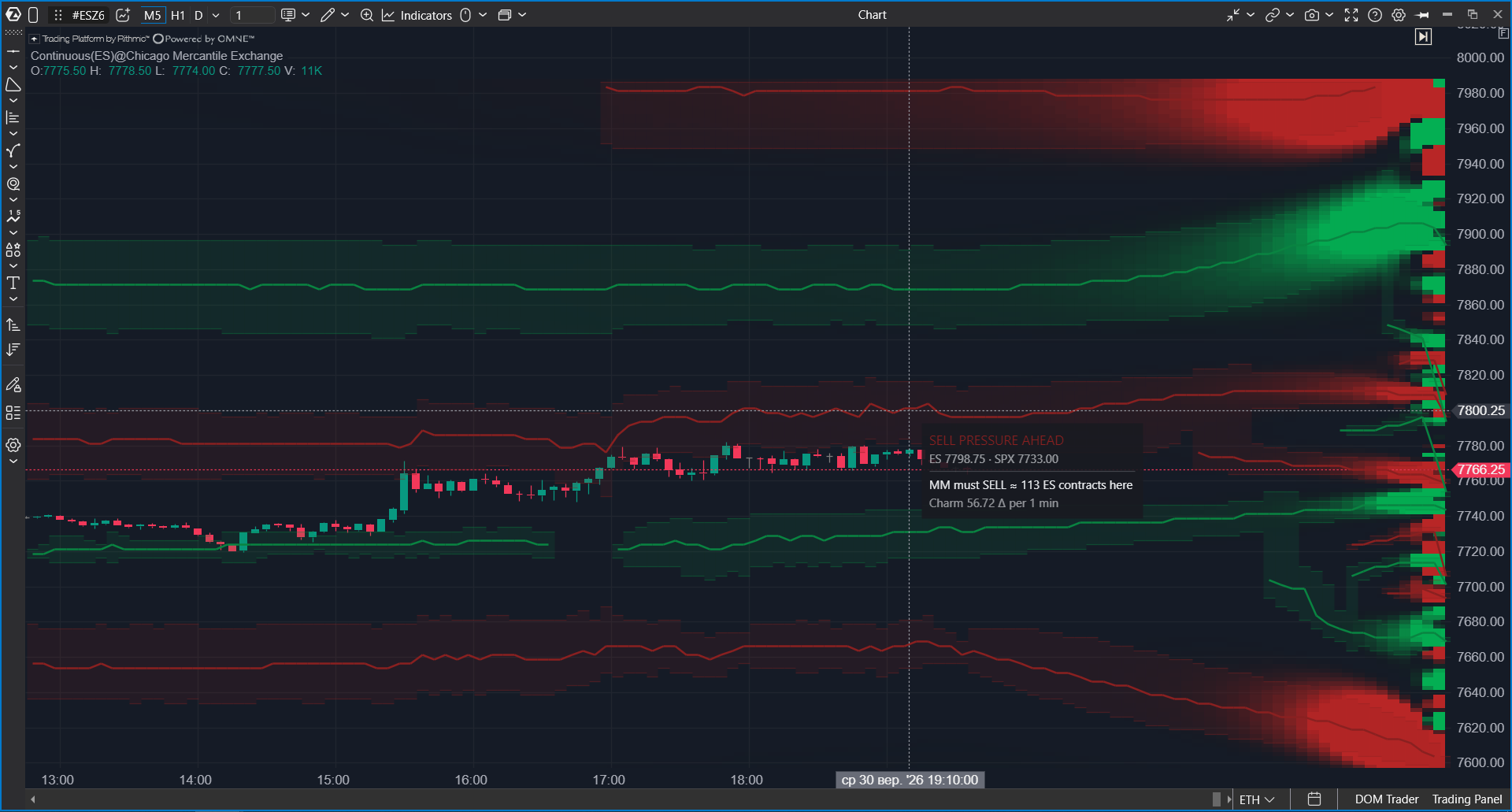
Options X-Ray: Charm Heatmap shows on an ES, MES, SPY, or US 500 chart where and when market makers may need to buy or sell ES futures simply because time is passing. Green areas show levels where market makers are expected to buy. Red areas show levels where they are expected to sell.
The map updates every minute and extends forward to the end of the session. This lets you see not only what has already happened, but also what flow is expected next if market positions do not change.
 Why Use It
A market maker sells options to traders and does not want to depend on where price moves. To hedge the options exposure, the market maker holds an ES futures position of the required size. That required hedge changes not only when price moves, but also as time passes.
As options approach expiration, options that are not profitable at the current price have less time left to become profitable. The futures hedge that was appropriate before can become too large or too small. The market maker then has to adjust it by buying or selling ES futures, even if price is not moving and there is no news.
Charm Heatmap calculates this forced flow for each price level and each minute of the session. It helps answer these questions:
- Which direction time decay is expected to push the market at the current price level.
- Which price levels have the strongest expected flow.
- How the expected flow may increase toward the close.
- Where slow movement in a quiet session may come from, for example a steady Friday afternoon drift.
Charm Heatmap is one of the most direct Options X-Ray maps because its condition is the passage of time, and time always passes. The forecast changes when market positions change. Still, market-maker flow is only one force. News or a large participant can override it.
Charm Heatmap is not a trading signal. It is a calculated estimate of how much market makers may need to trade based on current positions. It does not confirm that real trades have already happened. Confirm entries with your usual tools: tape, clusters, delta, and price reaction.
What You Should Know Before You Start
| Chart | Use an ES, MES, SPY, or US 500 chart. ES and MES work with any specific contract, for example ESZ5. The map is calculated from OptionsDepth analytics derived from CBOE market data for S&P 500 index (SPX) options, and it is mapped to the chart automatically. |
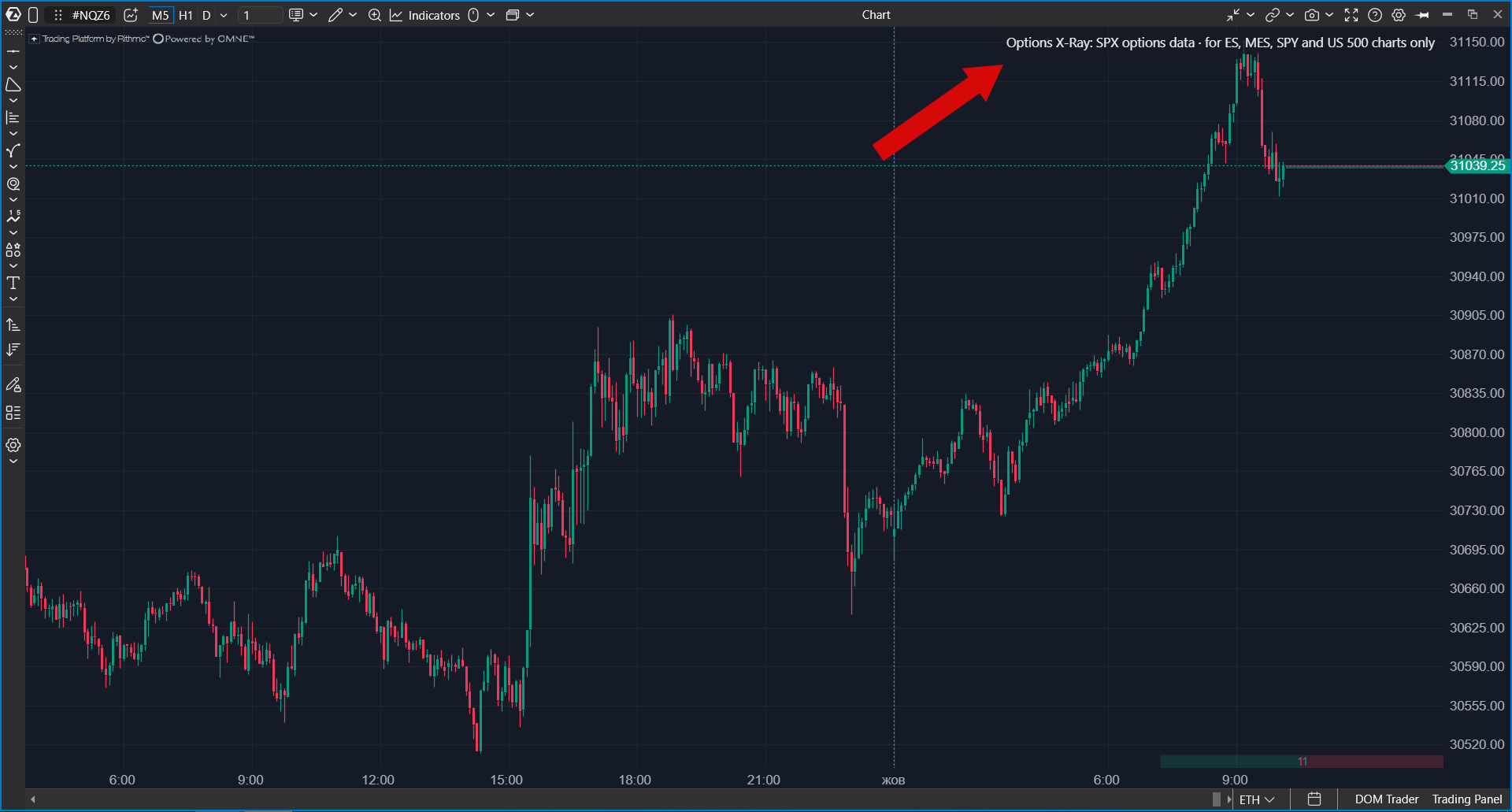
| Other markets | On any other instrument (NQ, oil, gold, individual stocks, crypto) the indicator draws nothing and shows an explanatory chip instead: Options X-Ray: SPX options data · for ES, MES, SPY and US 500 charts only. For CME futures options, use the separate Options Chain tools. |
| Update frequency | The map updates once per minute. |
| Units | Values are shown in ES contracts: how many ES futures market makers may need to buy or sell. |
| When it is strongest | Usually closer to the close. A large part of S&P 500 options volume is in options expiring the same day. The less time remains until expiration, the faster the required hedge can change. |
| Access | Options X-Ray indicators are part of a separate package. If the indicator is not in the list, check whether the package is enabled in your account. |
| Data | Built on minute-level SPX options positioning analytics derived from CBOE market data. Data & analytics by OptionsDepth. |
How to Read the Map
The map is drawn behind the candles. The horizontal axis is time, and the vertical axis is price. Each cell answers this question: if price is at this level at this time, what may market makers need to do?
| Element | Meaning |
| Green area | Time decay is expected to force market makers to buy ES futures. This flow can support price. |
| Red area | Time decay is expected to force market makers to sell ES futures. This flow can pressure price. |
| Brightness | Flow strength. Brighter areas mean more ES contracts may need to be bought or sold. |
| Pressure zones | Semi-transparent bands with a line inside. They highlight the strongest levels. The line follows the strongest level and can move during the day. |
| Right-edge column | The profile for the next trading day. |
First, look at the area where price is now and at the nearest areas above and below it. These are the zones price can reach during the session.
Do not confuse the colors with Options X-Ray: GEX Heatmap. In Charm Heatmap, color shows direction: green means market-maker buying, red means market-maker selling. In GEX Heatmap, the same colors describe whether price movement is dampened or accelerated.
The direction depends on market positions, not on the time of day. Traders often buy put options as protection, and in that case the passing of time can push market makers toward buying. If traders bought more call exposure, the same mechanism can work in the opposite direction.
History and Forecast
The map has two parts.
| Part | What it shows |
| Behind the candles | What actually existed at that time. Each minute is drawn using positions from that minute. The later forecast is not inserted backward. |
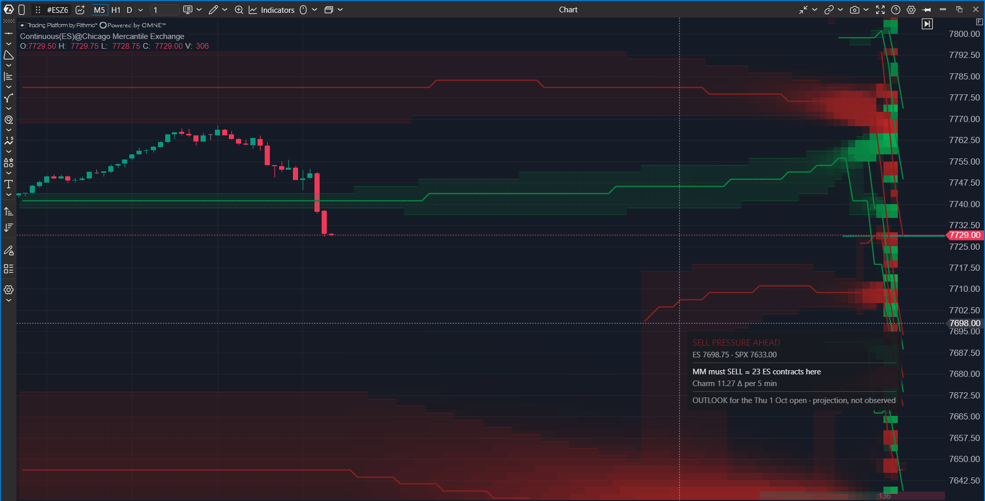
| To the right of the last candle | Forecast to the end of the current session using the latest positions: what may happen if positions do not change. After the close, this area shows a projection for the next session open. |
Market positions change constantly, so the forecast part is recalculated every minute. If the forward-looking area changes color or brightness, this is expected: positions changed.
Tooltip Card
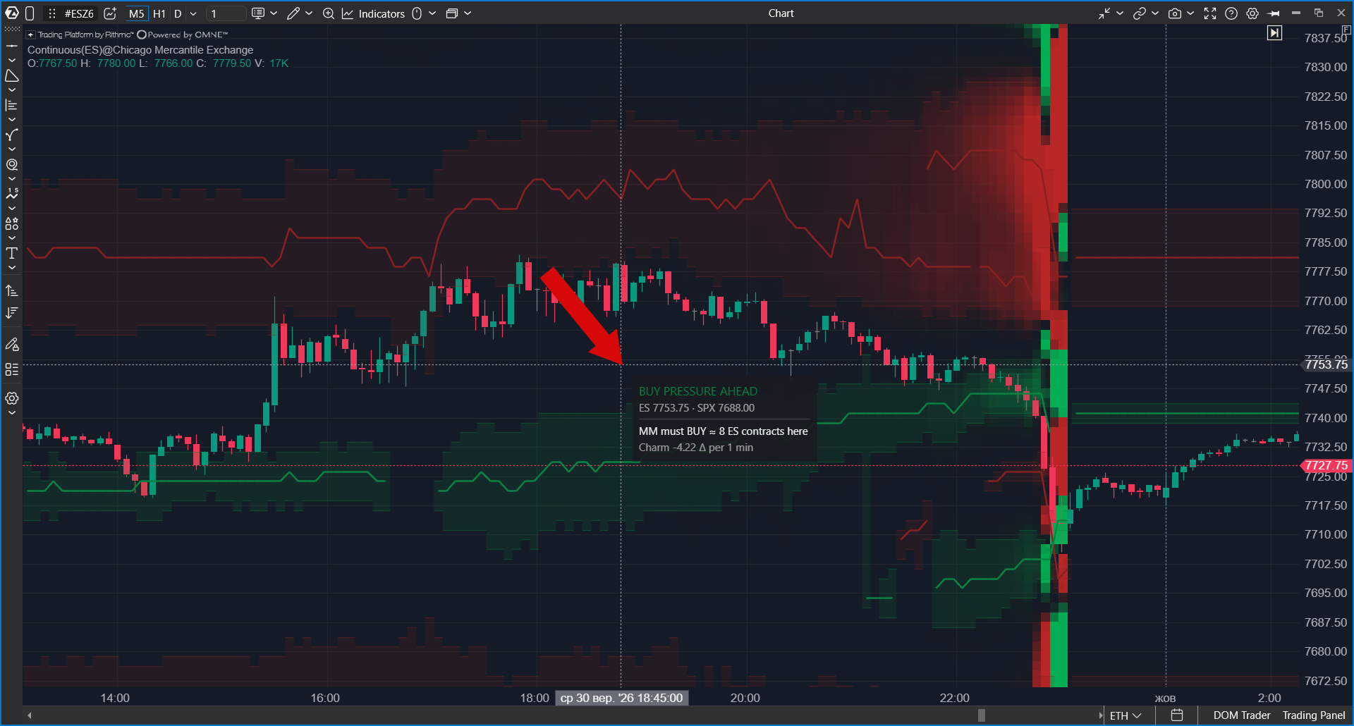
Hover over any part of the map to open a card with values for that level and time.
| Card row | What it shows |
| BUY PRESSURE AHEAD / SELL PRESSURE AHEAD | The expected direction of market-maker flow: buying or selling. |
| MM must BUY/SELL ≈ N ES contracts here | The main value: the approximate number of ES contracts market makers may need to buy or sell at this level. |
| Muted row below | The source value used to calculate the main number. For normal use, the main row is enough. |
| FORECAST not observed | You are hovering over the forecast area to the right of the last candle. This is a projection, not observed history. |
| OUTLOOK for the open | A projection for the next session open, shown after the close. |
How to Add the Indicator
- Open an ES, MES, SPY, or US 500 chart.
- Click Indicators on the top panel.
- Select the Options Analytics group or type Options in search.
- Select Options X-Ray: Charm Heatmap.
- Click Add to chart.
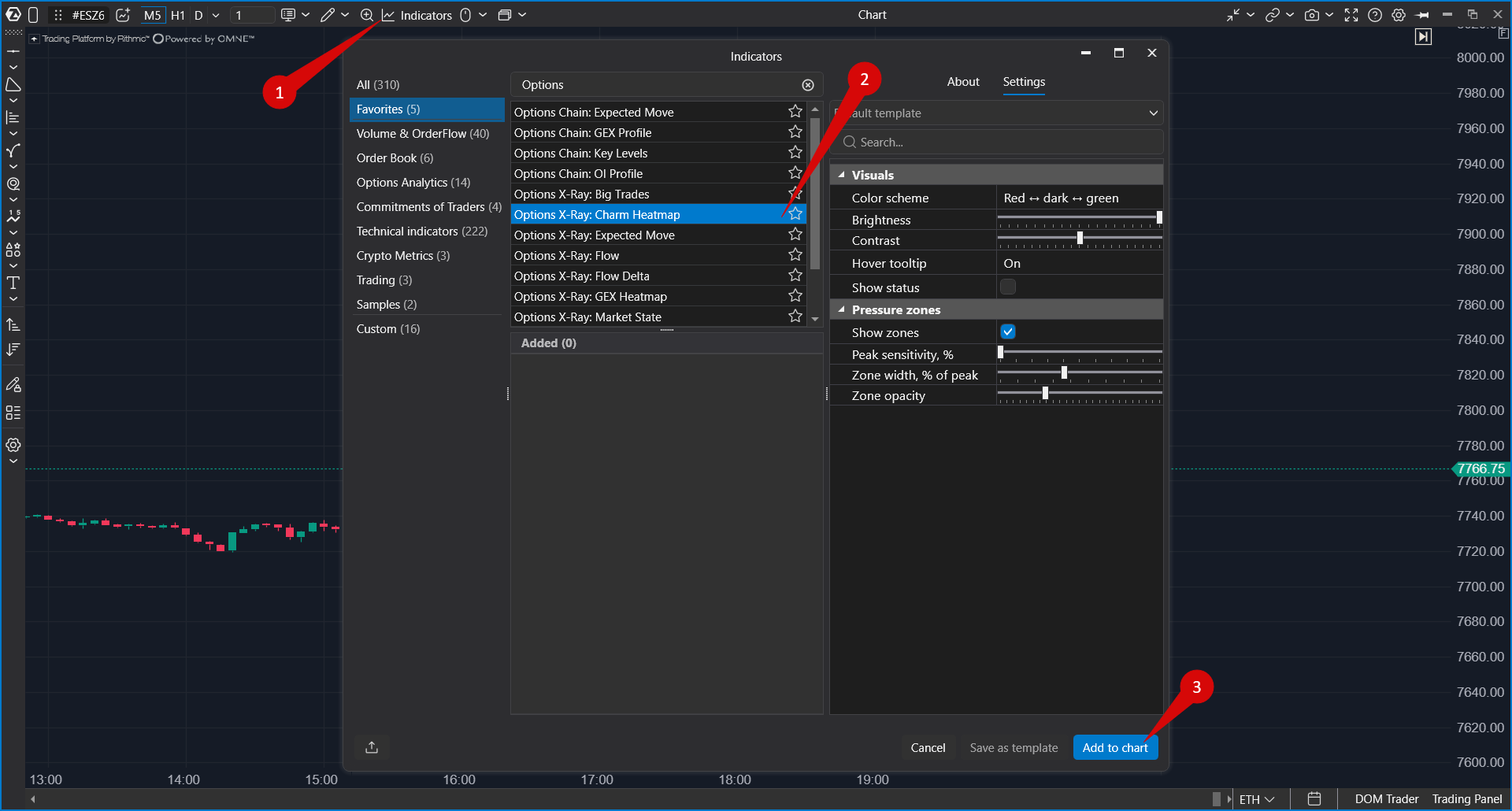
To change settings later, open Indicators again, select the indicator in the Added section, and click Apply.
Settings
The settings are split into two groups: Visuals, which control the map itself, and Pressure zones, which control the highlighted pressure zones. The indicator has no expiration selector. It is calculated using all options together.
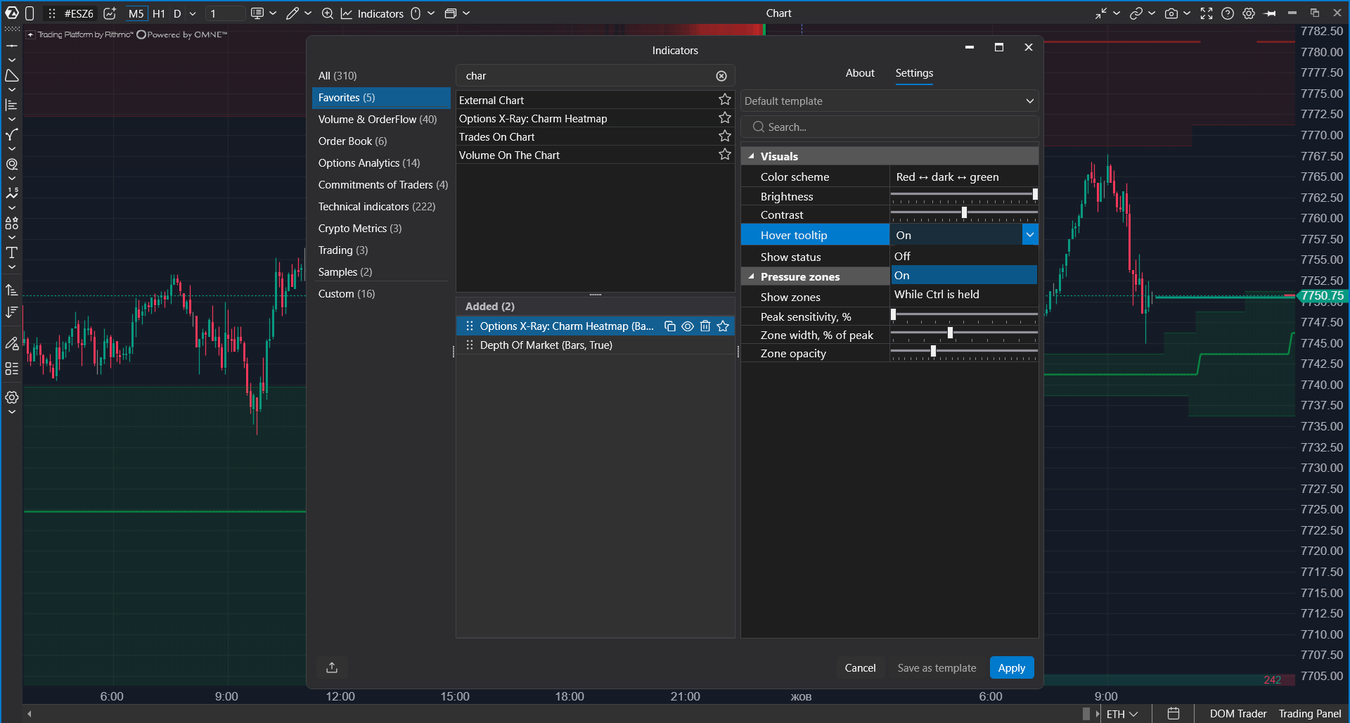
| Setting | What it does |
| Color scheme | Controls map colors. The default is red to dark to green: red means selling, green means buying. |
| Brightness | Controls overall map brightness. Reduce it if the map makes candles harder to see. |
| Contrast | Controls how strongly weak and strong areas differ. Higher contrast makes the strongest levels stand out more. |
| Hover tooltip | Controls the hover card: Off, On (default), or While Ctrl is held. The Ctrl mode keeps the chart clean and shows the card only on demand. |
| Show status | Shows the indicator status line in the chart corner. It can report issues such as imperfect level calibration. It is disabled by default. |
| Show zones | Shows pressure zones: semi-transparent bands around the strongest levels with a line at the strongest point. It is enabled by default. |
| Peak sensitivity, % | Controls how strong a level must be to receive its own zone. Lower values show more zones. Higher values leave only the strongest zones. |
| Zone width, % of peak | Controls zone width. It defines how far up and down from the peak the zone continues based on a percentage of the peak strength. |
| Zone opacity | Controls only the visual opacity of pressure zone fill. |
How to Work With the Indicator
Charm Heatmap is one of the maps that show forced market-maker trading. Each map answers a different question.
| Indicator | Question |
| Options X-Ray: GEX Heatmap | Where price movement may be slowed down and where it may be accelerated. |
| Options X-Ray: Charm Heatmap | Which direction the passage of time may push price. |
| Options X-Ray: Surface Profile | Exact values at levels for a selected moment, useful when map brightness is not enough to compare strength. |
- Check which color zone price is currently in.
- Look at the forecast area to the right and see how the flow may change toward the close at the current level and nearby levels.
- Hover over nearby bright zones and estimate how many ES contracts are expected there.
- Consider the time of day. The flow is usually stronger after midday than in the morning.
- Make trading decisions using tape, clusters, delta, and price reaction. The map describes the environment.
Troubleshooting
| What happens | What to do |
| The indicator is not in the list | Check whether the Options X-Ray package is enabled in your account. |
| The map is not drawn, and the chart shows the chip "Options X-Ray: SPX options data · for ES, MES, SPY and US 500 charts only" | The chart instrument is not supported. Open an ES, MES, SPY, or US 500 chart. |
| The map is not drawn on a supported chart | During weekends and holidays there is no new data, but previous sessions should still be displayed. |
| The map is barely visible in the morning | This is expected. Time-decay flow is usually weak in the morning and increases toward the close. |
| The forecast area changes every minute | The forecast uses fresh positions. If positions change, the forecast changes too. |
| Levels look inaccurate, and the indicator status mentions calibration | The chart does not have enough history to map index levels to the chart accurately. Load more days on the chart and enable Show status if you want to see the status line. |
| Values differ from other options analytics services | Different services use different data sources, update times, and calculation methods. Differences are normal. |
Was this article helpful?
That’s Great!
Thank you for your feedback
Sorry! We couldn't be helpful
Thank you for your feedback
Feedback sent
We appreciate your effort and will try to fix the article