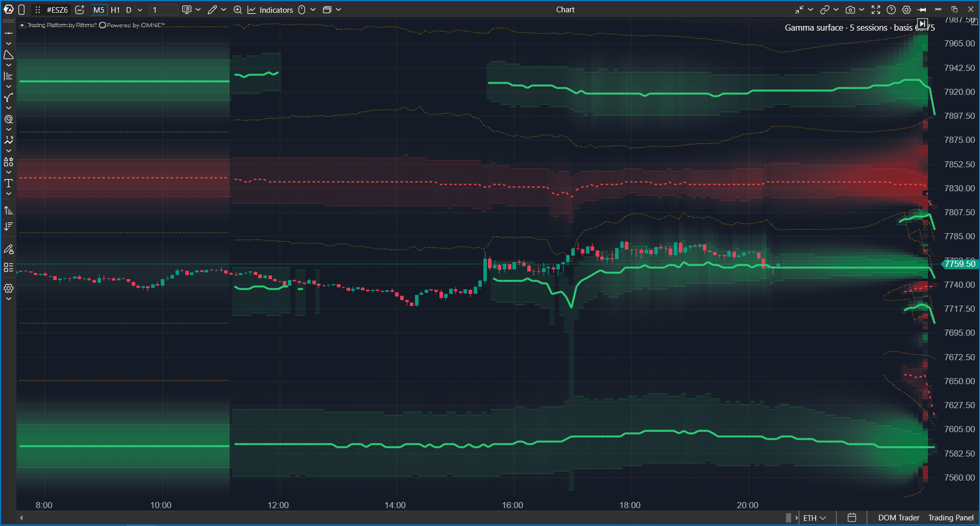
Options X-Ray: GEX Heatmap shows on an ES, MES, SPY, or US 500 chart where market-maker hedging is expected to slow price movement down and where it may accelerate it. The map is drawn behind the candles, updates every minute, and extends forward to the end of the session.
Use it to see where the market may feel sticky and where movement can become sharper.
 Why Use It
A market maker buys and sells options and does not want to depend on price direction. To hedge options exposure, the market maker holds an ES futures position and adjusts it when price moves. At different price levels, this hedging works differently.
| Regime | What market makers do | What happens to price |
| Damping | Trade against the move: sell when price rises and buy when price falls. | Movement is absorbed. Price often becomes sticky near large levels. |
| Amplifying | Trade with the move: sell when price falls and buy when price rises. | Movement is reinforced. Price can accelerate quickly. |
Market makers do this because of hedging requirements, not because they choose a directional view. GEX Heatmap estimates where each regime exists and how strong it is.
The map helps answer these questions:
- Is the market currently in a regime where movement is damped or amplified?
- Where is the nearest level where price may become sticky?
- Where is the boundary after which market behavior may change?
- Is a breakout more likely to fail or continue?
GEX Heatmap does not show direction. It describes the movement environment: sticky or sharp. Use tape, clusters, delta, Flow Delta, and Charm Heatmap to evaluate direction. The map is not a trading signal.
What You Should Know Before You Start
| Chart | Use an ES, MES, SPY, or US 500 chart. ES and MES work with any specific contract, for example ESZ5. The map is calculated from OptionsDepth analytics derived from CBOE market data for S&P 500 index (SPX) options, and it is mapped to the chart automatically. |
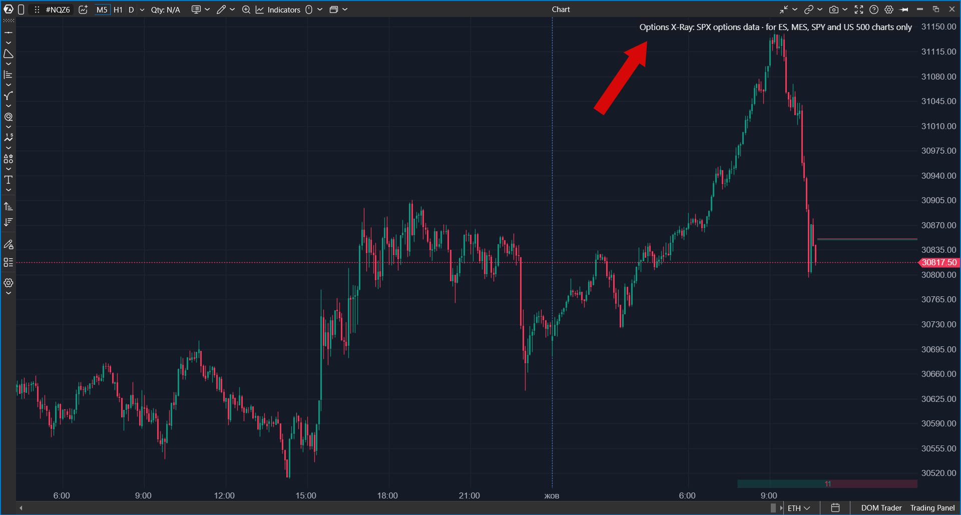
| Other markets | On any other instrument (NQ, oil, gold, individual stocks, crypto) the indicator draws nothing and shows an explanatory chip instead: Options X-Ray: SPX options data · for ES, MES, SPY and US 500 charts only. For CME futures, a similar map is available in the Options Chain set and uses option quotes from your broker connection. |
| Update frequency | The map updates once per minute. Many similar maps are built once per day from yesterday's data, while this indicator includes intraday position changes. |
| Units | Values are shown in ES contracts: how many futures market makers may need to buy or sell for each point of price movement. |
| Access | Options X-Ray indicators are part of a separate package. If the indicator is not in the list, check whether the package is enabled in your account. |
| Data | Built on minute-level SPX options positioning analytics derived from CBOE market data. Data & analytics by OptionsDepth. |
How to Read the Map
The horizontal axis is time, and the vertical axis is price. Each cell answers this question: if price is at this level at this time, will market-maker hedging damp movement or amplify it?
| Element | Meaning |
| Green side | Damping. Price movement is expected to be absorbed. |
| Red side | Amplifying. Price movement is expected to be reinforced. |
| Brightness | Strength of the effect: how many ES contracts market makers may need to trade per point of price movement. |
Candles are drawn above the map, so you can see how price moves across the map's structure: slowing in dense damping areas and moving quickly through weaker areas.
Regime Boundary and Walls
| Line or zone | What it shows |
| Dashed yellow line | The regime boundary. Above and below it, market makers behave differently. Usually, movement is damped on one side and amplified on the other. When price crosses the boundary, market behavior can change. The boundary moves during the day. |
| Zone with a line inside | A wall: the level where the effect is strongest. The line follows the strongest level and moves with it. A solid line means hedging tends to hold price. A dashed line means it tends to let price through. |
Levels on this map move. A wall that was at one level in the morning can move to another level by the evening. Check not only where the wall is now, but also where it moves in the forecast part of the map.
History and Forecast
| Map part | What it shows |
| Behind the candles | What actually existed at that time. Each minute is drawn using positions from that minute. Later forecasts are not inserted backward. |
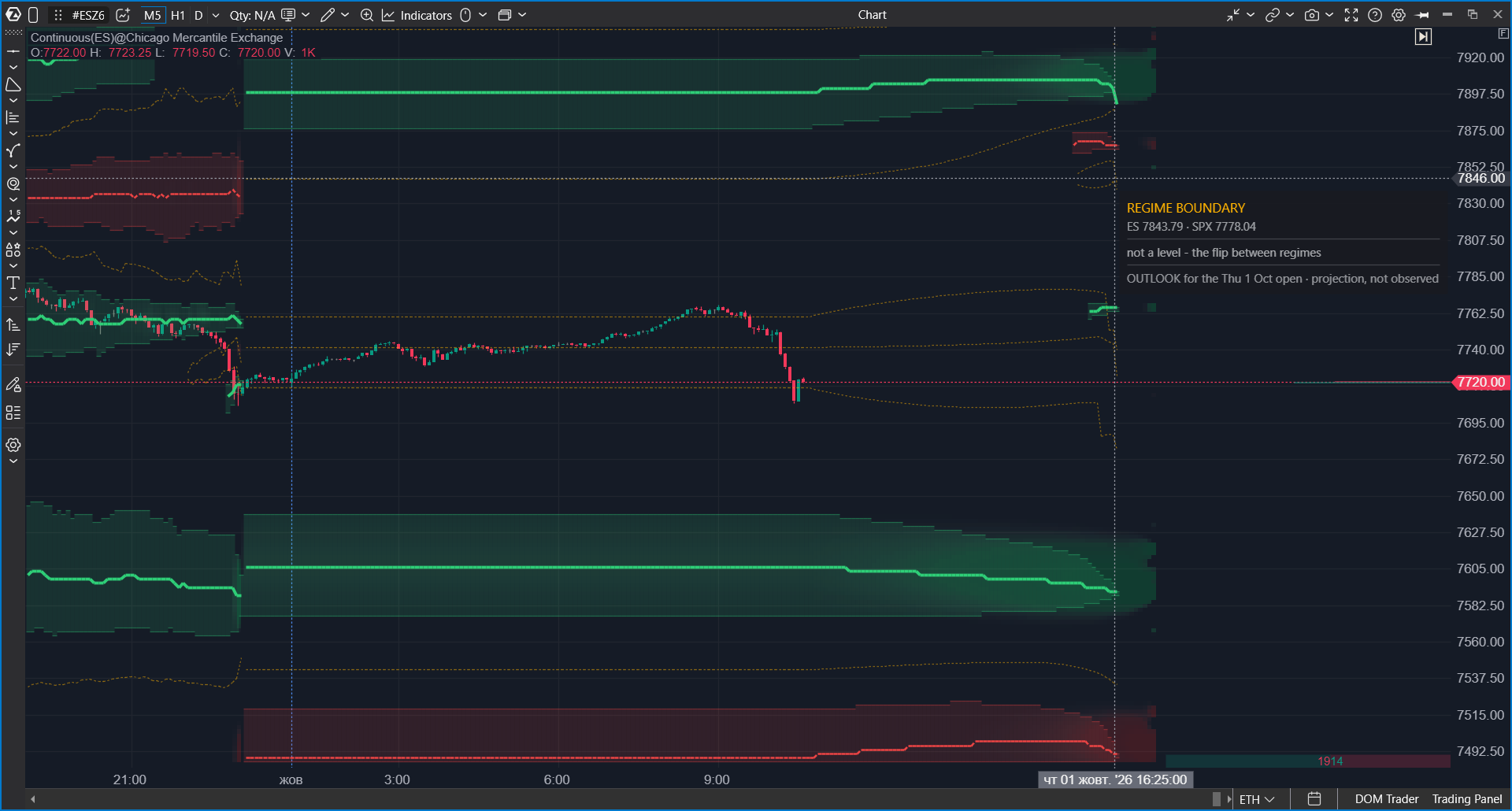
| To the right of the last candle | Forecast to the end of the current session using the latest positions: what may happen if positions do not change. After the close, it shows a projection for the next session open. The regime boundary and walls also continue into the forecast. |
Market positions change constantly, so the forecast is recalculated every minute.
 Tooltip Card
Hover over any part of the map to open a card for that level and time.
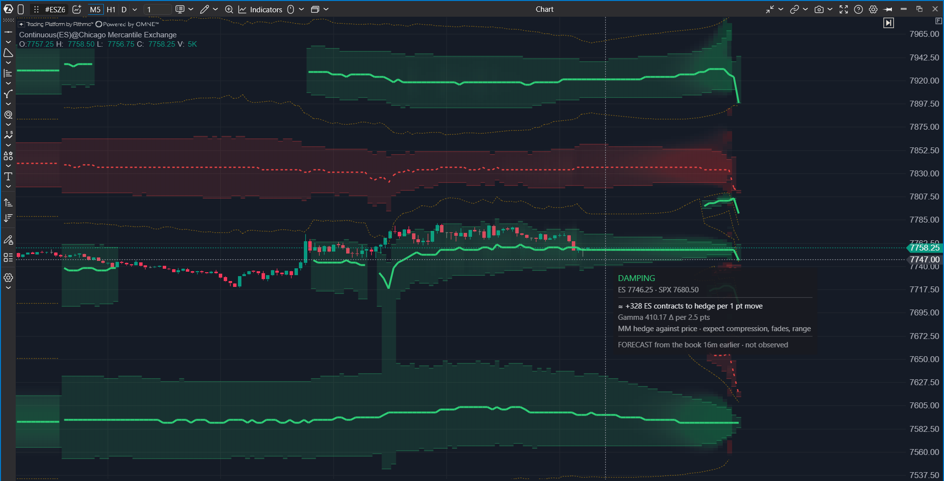
| Card row | What it shows |
| Time, chart level, SPX level | The time, the price level on the current chart, and the corresponding index level. The label names the chart instrument, for example ES 6612.50 · SPX 6600.00 on an ES chart or US500 6612.50 · SPX 6600.00 on a US 500 chart. |
| ES contracts to hedge per 1 pt move | The main value: approximately how many ES contracts market makers may need to buy or sell for each point of price movement at this level. |
| DAMPING / AMPLIFYING | The verdict: whether hedging is expected to slow movement or reinforce it. If the cursor is on a boundary or wall, the card can show REGIME BOUNDARY or the wall name. |
| Explanation row | A short explanation of the verdict: MM hedge with price — expect follow-through in the amplifying regime, or MM hedge against price · expect compression, fades, range in the damping regime. |
| Gamma value | The source value used to calculate the main number. For normal use, the main row is enough. |
| FORECAST not observed | You are hovering over the forecast part. This is a projection, not observed history. |
| OUTLOOK for the open | A projection for the next session open, shown after the close. |
How to Add the Indicator
- Open an ES, MES, SPY, or US 500 chart.
- Click Indicators on the top panel.
- Select the Options Analytics group or type Options in search.
- Select Options X-Ray: GEX Heatmap.
- Click Add to chart.
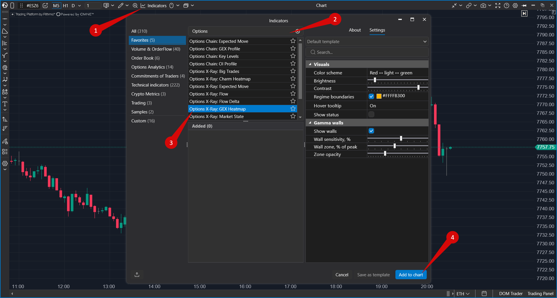 To change settings later, open Indicators again, select the indicator in the Added section, and click Apply.
Settings
The indicator has no expiration selector. The map is calculated using all options together.
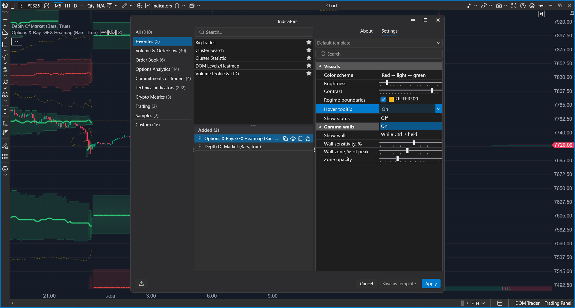
| Setting | What it does |
| Color scheme | Controls map colors. The default is red to light to green. |
| Brightness | Controls overall map brightness. The default is moderate so candles remain visible. |
| Contrast | Controls how strongly weak and strong areas differ. The default is high so the strongest levels stand out. |
| Regime boundaries | Shows or hides the dashed regime boundary. The default color is yellow. |
| Hover tooltip | Controls the hover card: Off, On (default), or While Ctrl is held. The Ctrl mode keeps the chart clean and shows the card only on demand. |
| Show status | Shows the indicator status line in the chart corner, including calibration notes. It is disabled by default. |
| Show walls | Shows wall zones around the strongest levels with a line inside. It is enabled by default. |
| Wall sensitivity, % | Controls how strong a level must be to count as a wall. Lower values show more walls. Higher values leave only the strongest walls. |
| Wall zone, % of peak | Controls wall-zone width based on a percentage of the peak strength. Lower percentages create wider zones; higher percentages create narrower zones. |
| Zone opacity | Controls only the visual opacity of wall zones. |
How to Work With the Indicator
GEX Heatmap is one of the maps that show forced market-maker trading. Each map answers a different question.
| Indicator | Question |
| Options X-Ray: GEX Heatmap | Where price movement may be damped and where it may be amplified. |
| Options X-Ray: Charm Heatmap | Which direction the passage of time may push price. |
| Options X-Ray: Surface Profile | Exact values at levels for a selected moment. |
| Options X-Ray: Expected Move | What move the market has priced in for the day. |
- Check which side of the regime boundary price is on: damping or amplifying.
- Find the nearest walls above and below price and see where they move in the forecast area.
- Near a damping wall, expect price to become sticky. Use Big Trades to check whether someone is building exposure for a breakout.
- If price crosses into an amplifying regime, be ready for sharper movement. If it crosses into a damping regime, expect a stickier market.
- Confirm entries with tape, clusters, and delta. The map shows the environment, not the entry moment.
Troubleshooting
| What happens | What to do |
| The indicator is not in the list | Check whether the Options X-Ray package is enabled in your account. |
| The map is not drawn, and the chart shows the chip "Options X-Ray: SPX options data · for ES, MES, SPY and US 500 charts only" | The chart instrument is not supported. Open an ES, MES, SPY, or US 500 chart. |
| The map is not drawn on a supported chart | During weekends and holidays there is no new data, but previous sessions should still be displayed. |
| The map covers the candles | Reduce Brightness or Zone opacity. |
| There are too many walls | Increase Wall sensitivity, %. |
| Walls and the boundary move | This is expected. Positions change during the day, and levels move with them. |
| The forecast area changes every minute | The forecast uses fresh positions. If positions change, the forecast changes too. |
| Levels look inaccurate, and the status mentions calibration | The chart does not have enough history to map index levels to the chart accurately. Load more days on the chart and enable Show status if needed. |
| Levels differ from other services | Many services build such maps once per day from yesterday's data. This map recalculates every minute, so differences are normal. |
Was this article helpful?
That’s Great!
Thank you for your feedback
Sorry! We couldn't be helpful
Thank you for your feedback
Feedback sent
We appreciate your effort and will try to fix the article