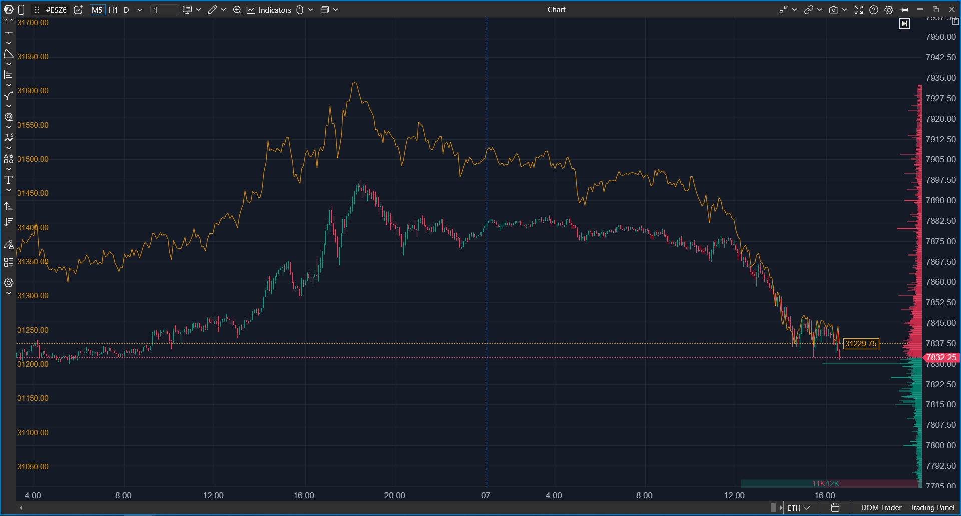
Overlay draws a second instrument on top of your chart. For example, you can see NQ right on your ES chart, without opening another window and without trading NQ.
Why Use It
Related markets often move together. When they stop moving together, it can be useful information. With an overlay you can compare two instruments bar by bar on your working chart:
- see whether NQ confirms a move on ES or lags behind;
- see which instrument breaks a level first;
- compare a stock with its index, or a contract with a related one.
An overlay is for visual comparison only. You cannot trade the overlay instrument from the chart, and indicators on the chart are not calculated from its data.
What You Should Know Before You Start
| Version | ATAS 8.0.15 and later, in both ATAS and ATAS X. |
| Timeframe | The overlay always uses the chart's timeframe and changes with it. Time, tick, volume, Delta, Range, Renko and other bar types are supported. Overlays are not available on Order Flow and Cumulative Trades charts. |
| History | The overlay loads the same period as the chart, but no more than 30 days. On a chart with deeper history, the overlay covers only the most recent part. |
| Number of overlays | You can add several overlays to one chart. |
| Saving | Overlays are saved with the chart template and the workspace. |
| Data | The overlay instrument must be available in your connections, just like any instrument you open on a chart. |
How to Add an Overlay
- In the chart header, click the Overlay button. It is an icon with a small chart and a plus sign, right after the instrument selector.
- The Instruments Manager opens. Choose the instrument, for example NQ.
The overlay appears on the chart right away. There is no settings window at this step; you can change everything later.
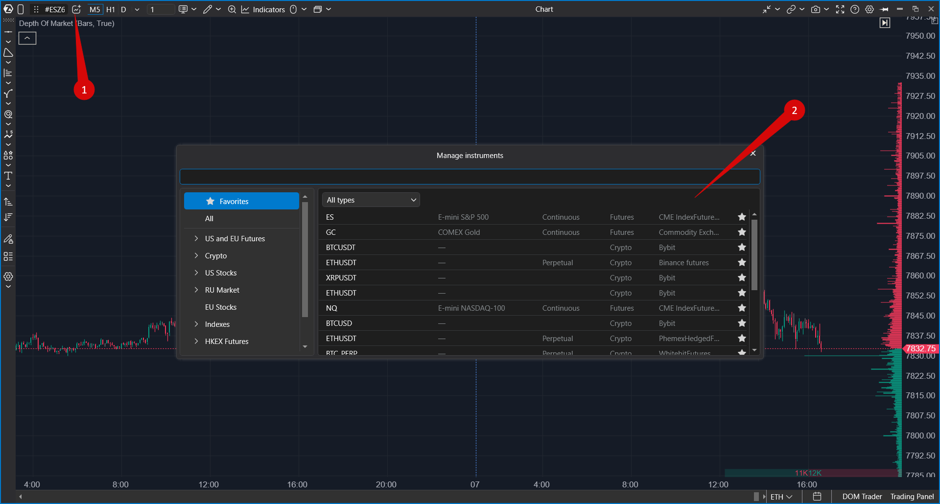
The button is inactive on Order Flow and Cumulative Trades charts, and in Market Replay while changing the instrument is not allowed.
What You See on the Chart
| Element | Meaning |
| Line, candles or area | The overlay instrument. A line by its Close price is shown by default. |
| Scale on the left | The overlay's own scale. The main price scale on the right does not change. |
| Dotted line and price label on the right | The last price of the overlay instrument. |
| Row in the legend | Overlay colour, instrument name, change of the last price from the open of the last day in %, and the scale factor if it is not 1. Three buttons on the right: hide or show, settings, delete. |
Bars are matched by their open time. If the overlay instrument has no bar at some time (for example, the sessions are different), the line and the area continue from the last known Close, and candles are not drawn for that bar.
While data is loading, the legend shows Loading.... If the data cannot be loaded, it shows Loading error.
Overlay Settings
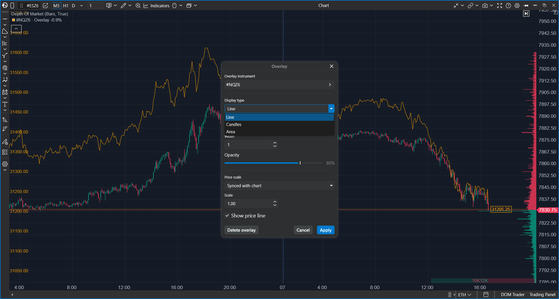
Open the settings with the settings button in the legend row, or right-click the overlay line and choose Settings. Changes are applied on the chart as you make them. Cancel or Esc reverts them, Apply or Enter keeps them.
| Setting | What it does |
| Overlay instrument | Changes the overlay instrument without removing the overlay. |
| Display type | Line (default), Candles or Area. |
| Color | Colour of the line or area. It is also used for the legend and the overlay scale. Orange by default. |
| Up candle color / Down candle color | Shown instead of Color when Display type is Candles. |
| Width | Line width from 1 to 10. Default: 1. Not available for candles: they take the width of the chart bars. |
| Opacity | From 10 to 100%. Default: 80%. To hide the overlay completely, use the hide button in the legend. |
| Price scale | How the overlay is placed against the chart price. See the next section. |
| Scale | Stretches or compresses the overlay's movement, from 0.01 to 100. Default: 1. Available only in Synced with chart mode. |
| Show price line | Shows the dotted last-price line and the price label. On by default. |
| Delete overlay | Removes the overlay from the chart. |
Price Scale Modes
| Mode | How it works |
| Synced with chart | Default. The overlay starts at the chart price at the beginning of its history and then follows its own percentage moves, multiplied by Scale. Good for comparing the direction and strength of moves, for example ES and NQ. |
| % of visible range | The overlay is shown as a percentage change, fitted to the visible part of the chart. |
| Separate axis | The overlay uses its own price axis on the left, in its own prices. |
| Main price scale | The overlay is drawn in its real prices on the main price scale. Useful for instruments with close prices, for example two contract months of the same future. |
Only the first overlay with its own scale shows the scale on the left. Other overlays are drawn without axis labels.
Working with the Overlay on the Chart
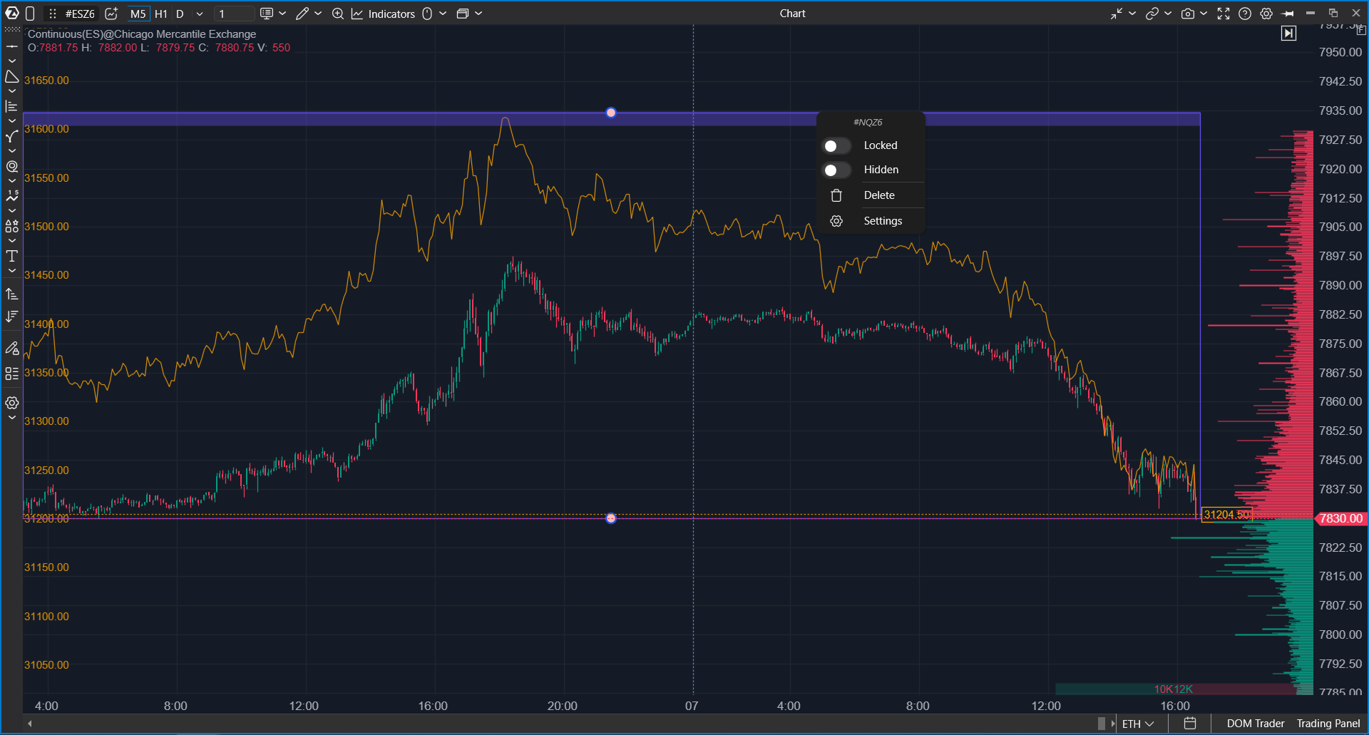
- Select: click the overlay line. A frame with handles appears at the top and bottom.
- Move: drag the line up or down. Dragging sideways scrolls the chart as usual.
- Stretch or compress: drag the top or bottom handle of the frame.
- Zoom the overlay scale: drag the left scale or turn the mouse wheel over it. Double-click the scale to return to automatic scaling.
- Delete: select the overlay and press Delete. Esc removes the selection.
- Context menu: right-click the line to open Locked, Hidden, Delete and Settings. A locked overlay cannot be selected, moved or scaled by mistake.
In Synced with chart mode, a manual shift is saved with the chart. In the other modes, manual scaling is reset when the chart is reopened.
If Something Goes Wrong
| Problem | What to check |
| The Overlay button is inactive | The chart uses Order Flow or Cumulative Trades bars, or you are in Market Replay where changing the instrument is not allowed. Switch to another chart type. |
| "Instrument ... is not available" | The instrument is not available in your current connections. Check that the connection that provides it is active. |
| Loading error in the legend | The platform could not load data for the overlay instrument. Check the connection, then delete the overlay and add it again. If the chart uses a custom trading session, try the standard session. |
| The overlay does not cover the whole chart | Overlay history is limited to 30 days. On older bars the overlay is not drawn. |
| The overlay looks flat or too steep | Change Scale in Synced with chart mode, or drag the frame handles. You can also try % of visible range. |
| A message about the tariff limit | The overlay counts as an additional open instrument. Your plan may limit the number of instruments or timeframes you can open. |
| The second overlay has no scale | This is expected: only the first overlay with its own scale shows it. |
Was this article helpful?
That’s Great!
Thank you for your feedback
Sorry! We couldn't be helpful
Thank you for your feedback
Feedback sent
We appreciate your effort and will try to fix the article