Options X-Ray: Big Trades shows the largest intraday changes in options positioning directly on the chart of the underlying instrument. It helps you see where a large change happened, which strike it belongs to, which participant group created it, and whether exposure was added or reduced.
The indicator is part of the Options X-Ray set. It works with options flow and positioning data, not with regular tape volume. Values are shown as delta exposure in an ES-equivalent context, so they should not be read as the number of option contracts.
Before you start
Use this indicator on a supported underlying instrument and make sure that the required options data and Options X-Ray access are available for your account.
The Options X-Ray flow indicators use minute-by-minute snapshots of options positioning. A chart bar aggregates the minute changes that happened inside that bar.
Key concepts
Delta exposure
Options X-Ray indicators show exposure in an ES-equivalent. This makes it easier to compare options positions by directional risk instead of comparing raw option contract counts.
Net
Net is the final signed change in exposure for the selected bar. It helps show whether exposure ended higher or lower after all changes inside the bar were combined.
Repositioned
Repositioned is the total amount of exposure that moved inside the bar, counting movement in both directions. A bar can have a large repositioned value and a small net value if participants moved a lot of exposure but finished close to where they started.
Participant groups
Options X-Ray separates flow by participant groups. This helps identify whether a large change came from retail traders, professionals, firms, brokers, or market makers when that data is available.
What the indicator shows
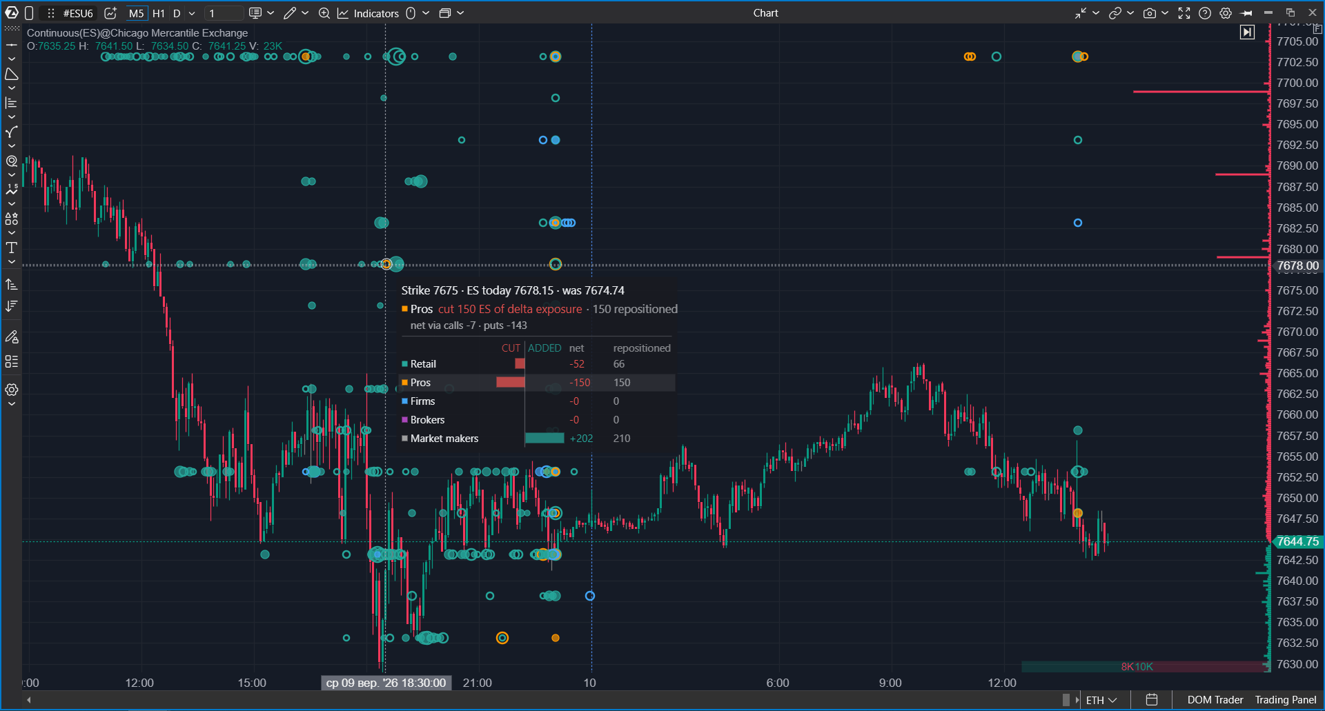
Options X-Ray: Big Trades marks the largest changes in options delta exposure as bubbles on the price chart.
- The horizontal position shows the chart bar where the change happened.
- The vertical position shows the option strike connected with that change.
- The bubble size is based on repositioned exposure.
- The bubble color shows the participant group.
- A filled bubble means exposure was added.
- An outlined bubble means exposure was reduced.
By default, the course describes the indicator as showing the largest 2% of the session. The threshold is calculated by session, so zooming the chart should not change which bubbles qualify for the selected filter.
Why it is useful
Use Options X-Ray: Big Trades when you want to move from a general options-flow view to a specific strike and participant group.
The indicator can help answer questions such as:
- where the largest options exposure changes happened during the session;
- which strikes attracted the largest repositioning;
- whether exposure was added or reduced;
- which participant group created the move;
- whether the activity appeared near the current price or an important option level.
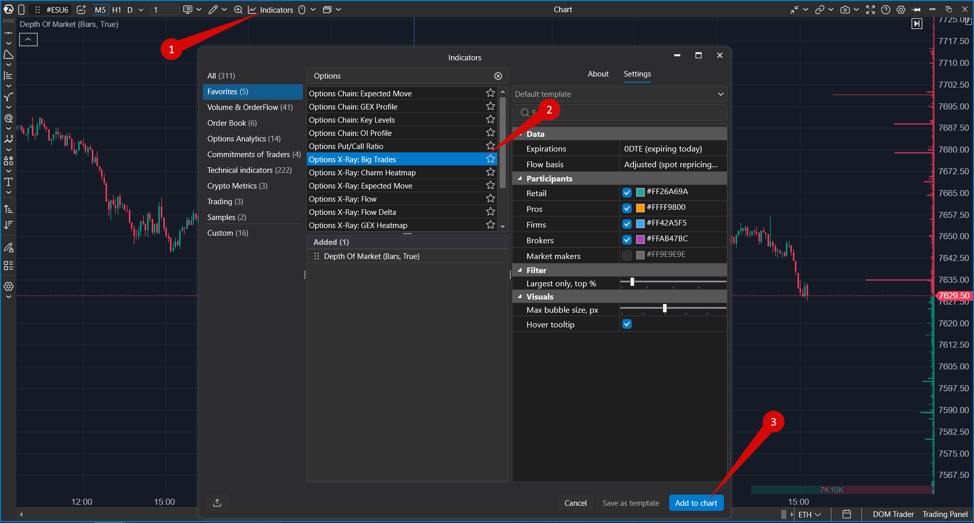
How to add the indicator
- Open a chart of the supported underlying instrument.
- Open the Indicators window.
- Open the Options Analytics group.
- Select Options X-Ray: Big Trades.
- Add the indicator to the chart.
- Adjust the settings and click Apply.
 Settings
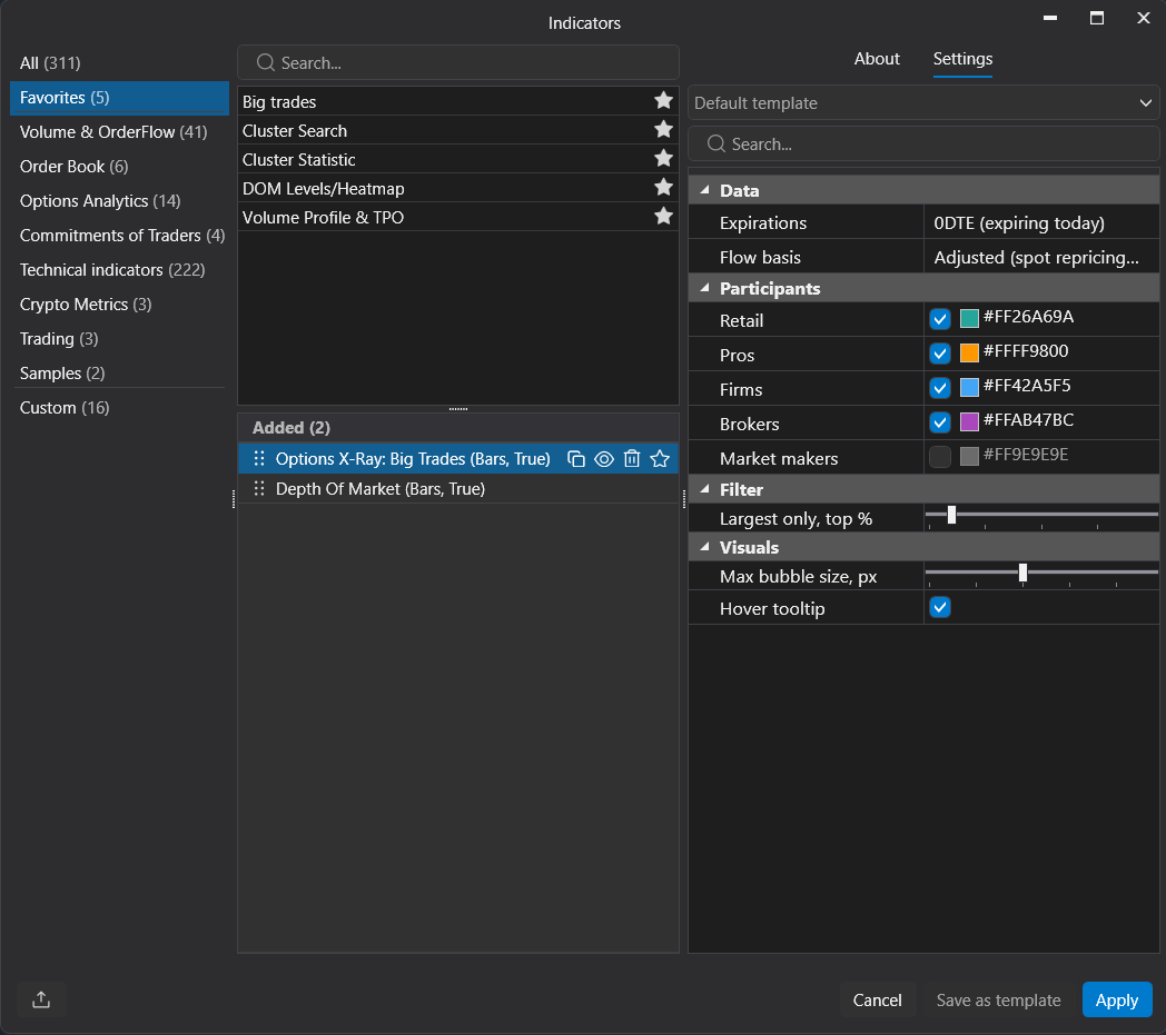
The indicator settings are grouped into Data, Participants, Filter, and Visuals.
| Group | Setting | Description |
|---|---|---|
| Data | Expirations | Selects which expiration group is included in the calculation. 0DTE (expiring today) focuses on the options series that expires during the current trading day. |
| Data | Flow basis | Defines the basis used to calculate options flow. The visible example is Adjusted (spot repricing...). This setting should be checked before comparing values between charts because a different basis can change how exposure changes are interpreted. [TO CONFIRM: full value name and final public description.] |
| Participants | Retail | Shows or hides the retail participant group. The color swatch sets the bubble color for this group. |
| Participants | Pros | Shows or hides professional traders. The color swatch sets the bubble color for this group. |
| Participants | Firms | Shows or hides firms. The color swatch sets the bubble color for this group. |
| Participants | Brokers | Shows or hides brokers. The color swatch sets the bubble color for this group. |
| Participants | Market makers | Shows or hides market makers when this participant group is available. In many flow readings, market makers are the other side of client activity, so enable this group only when you intentionally want to include it in the view. |
| Filter | Largest only, top % | Controls how many of the largest exposure changes are displayed. A lower percentage shows only the most exceptional bubbles. A higher percentage shows more events and makes the chart denser. |
| Visuals | Max bubble size, px | Sets the maximum bubble size in pixels. It changes only the visual scale of bubbles and does not change the calculation or the filter. |
| Visuals | Hover tooltip | Turns the tooltip on or off. When enabled, hovering over a bubble opens the detail card for the selected bar and strike. |
How to read the settings
Expirations
Start with 0DTE (expiring today) when analyzing current-day options flow. Use another expiration selection when you want to look beyond the current-day series or compare today’s activity with positioning that remains after the close.
Flow basis
Use the same Flow basis when comparing multiple charts or multiple Options X-Ray indicators. If the basis differs, two charts can show different flow values even when the same participants and expiration are selected.
Participants
Use participant checkboxes to control whose flow is shown. If several groups are enabled, the chart helps compare which group created the largest repositioning. If only one group is enabled, the indicator becomes a focused view of that participant group.
The color next to each participant controls how that group appears on the chart. Choose colors that are easy to distinguish on the selected chart theme.
Largest only, top %
This filter keeps the chart focused on the largest exposure changes. If the chart is too crowded, reduce the percentage. If the chart shows too few bubbles, increase it.
Max bubble size, px
This setting controls the maximum visual size of the bubbles. Increase it if the largest events are hard to notice. Decrease it if large bubbles cover candles, price levels, or other indicators.
Hover tooltip
Keep Hover tooltip enabled when you need to inspect exact details. Disable it if the tooltip gets in the way while reviewing the chart.
Tooltip details
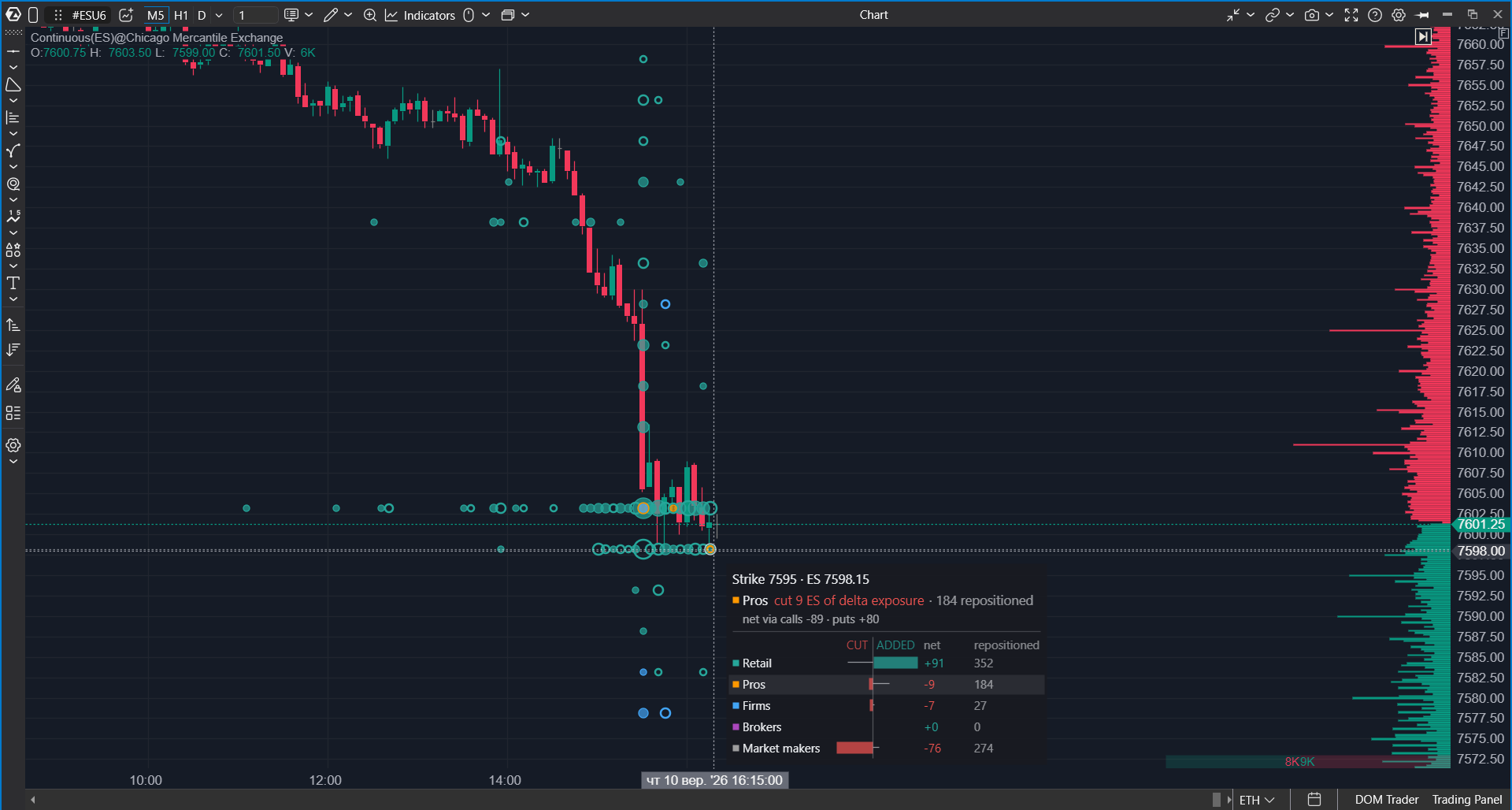
Hover over a bubble to inspect the selected strike and bar. The tooltip can help check whether the visible bubble represents one-sided pressure or large two-sided repositioning.
The tooltip can show:
- the selected strike;
- which participant group added or reduced exposure;
- net change through calls and puts;
- net and repositioned values for participant groups;
- a strike-level breakdown for comparing participants.
 Practical workflow
- Select the expiration group, for example 0DTE (expiring today).
- Select the participant groups you want to analyze.
- Use Largest only, top % to control how many bubbles are shown.
- Adjust Max bubble size, px so the chart stays readable.
- Hover over the most important bubbles and compare net with repositioned.
- Compare the bubble location with price reaction, nearby strikes, and other Options X-Ray indicators.
Practical recommendations
- Use a smaller Largest only, top % value for a cleaner chart with only the largest events.
- Use a larger value when you need more context around medium-sized repositioning.
- Keep expiration, participants, and flow basis consistent when comparing charts.
- Do not treat a large bubble as a trading signal by itself. Check price reaction and the surrounding options context.
- Use the tooltip to avoid confusing high repositioned activity with a strong final net move.
Frequently asked questions
Is this the same as the regular Big Trades indicator?
No. Regular Big Trades is based on large trades in the selected instrument’s tape. Options X-Ray: Big Trades is based on changes in options positioning and displays them by strike.
Why can a large bubble have a small final directional effect?
The bubble size is based on repositioned exposure. If exposure moved strongly in both directions inside the bar, repositioned can be large while net ends close to zero.
Why does the same strike show different participant groups?
Several participant groups can change exposure at the same strike during the same bar. Use the tooltip and participant filters to separate their contribution.
Why does the chart show no bubbles?
Check that options data is available, the selected expiration contains activity, the required participant groups are enabled, and Largest only, top % is not too strict.
Why do values differ from another chart or service?
Values can differ because of different data sources, expiration selections, participant filters, flow basis, strike mapping, aggregation windows, or delta-exposure conversion rules.
Was this article helpful?
That’s Great!
Thank you for your feedback
Sorry! We couldn't be helpful
Thank you for your feedback
Feedback sent
We appreciate your effort and will try to fix the article